Brand Refresh
THE CHALLENGE: BRAND CHAOS
When I came on to lead the Sierra Club’s newly consolidated creative team, the brand lacked a unified foundation: no consistent guidelines, no shared strategy, and highly siloed brand and visual practices.
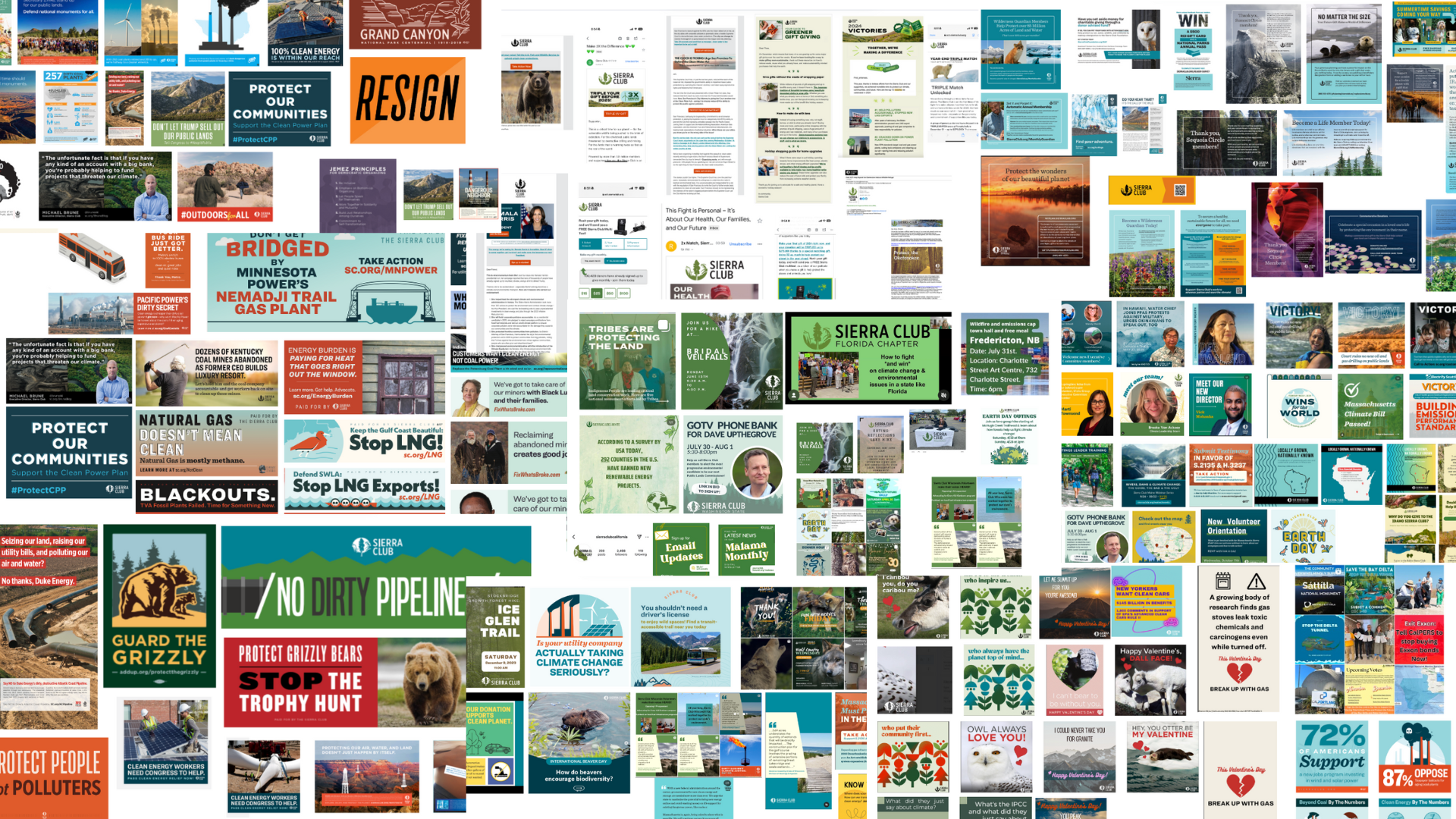
I launched and led a visual identity refresh, beginning with a rigorous audit across national, chapter, and volunteer communications. The results highlighted a widespread lack of cohesion that was diluting the organization’s impact and recognition, setting the stage for a renewed brand system.
The Strategy
The organization needed a brand identity that could unify grassroots efforts across the country while remaining flexible enough to serve diverse issues, regions, and audiences.
The result was a brand voice and identity that is rooted in the Sierra Club’s 130-year legacy and reframed through a contemporary lens to bridge its historic power credibility with its future ambitions.
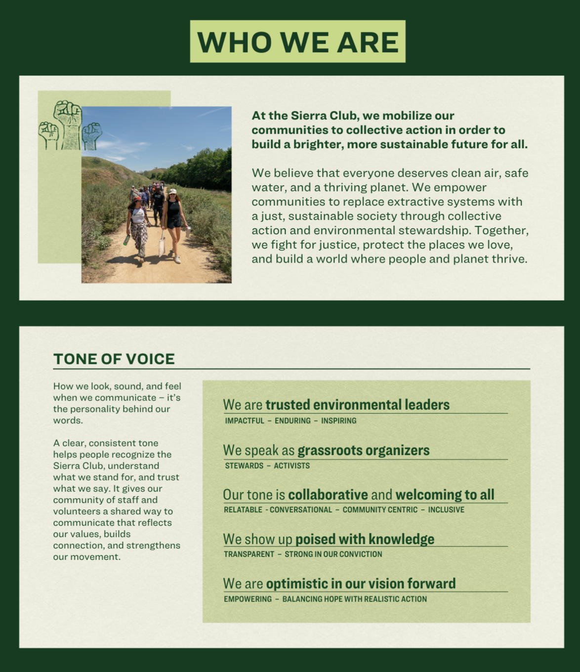
The Guide
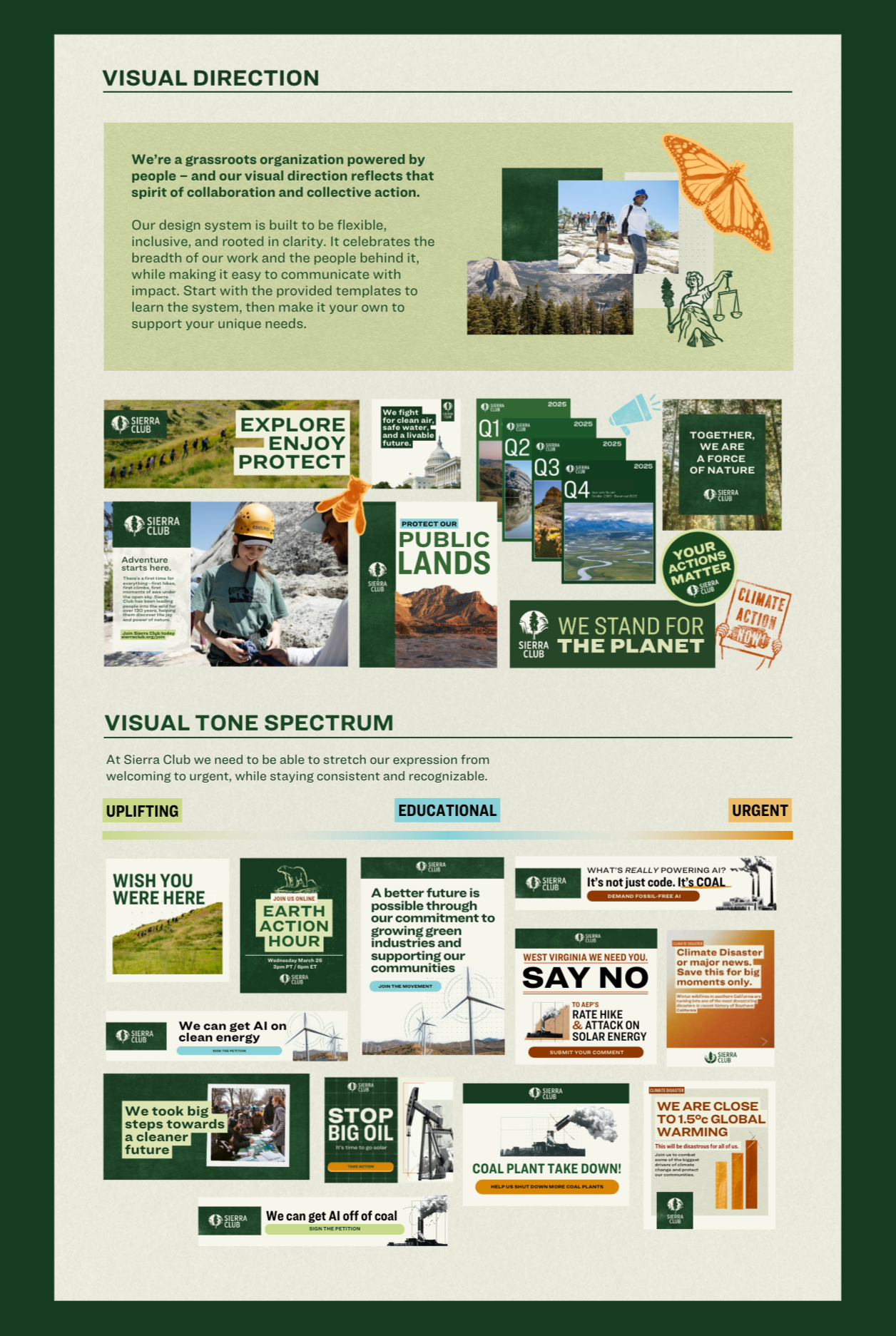
The refreshed style guide reestablished a unified visual language for the Sierra Club. It brought clarity to color and typography, established a cohesive photography style, and introduced a toolkit of brand elements rooted in the organization’s history; from hand-drawn icons and stamp textures to topographic lines and organic forms.
Together, these assets equip staff and volunteers nationwide with the tools to show up more consistently and authentically in their organizing work.
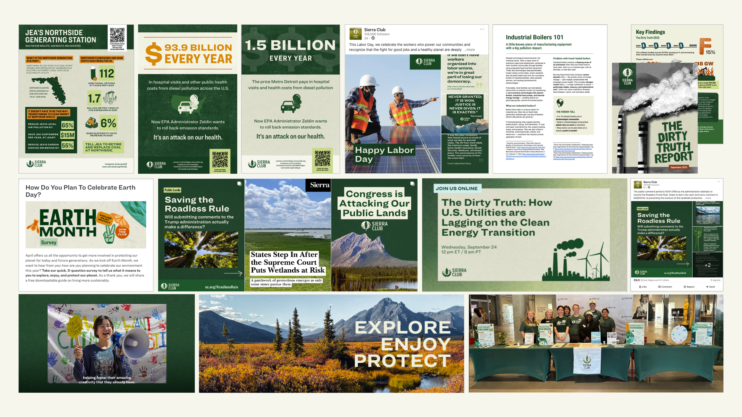
The Brand Tools
With an organization powered by both staff and thousands of volunteers, democratizing the brand was essential. We built a comprehensive suite of tools and templates — spanning social graphics, reports, flyers, merch, stickers, and rally signs — to equip organizers with consistent, on-brand assets they could use immediately in their work.